Ida Bjerga is the Founder and Managing Director of Noise studio, a Danish studio specialised in digital strategy, branding and design for Sports Brands & Sports Tech. All of the staff members are passionate athletes with a creative mindset. Let’s chat with Ida to understand how to be different can make a difference in your surf business.
Hi Ida! Noise studio is a creative agency for Sport Brand and Sport Tech. Why have you implemented such a selective choice?
Noise Studio is a creative agency for sports outdoors - and sports tech organizations - basically we are a bunch of sporty, passionate people that one day though “wouldn’t it be cool if we could design and brand other sports organizations, we would all learn a lot, meet some cool people and have a great time doing it.”
And that’s what we are up to today - we create inspiring and crazy designs, from mobile and web UX UI to creative campaigns and graphic material for clients all around the world.
We feel an insane pleasure of aligning our main interests: digital design, the outdoors and sports. Everybody in the Noise team practice extreme sports and we know the thrill, excitement and commitment that comes with those activities.
They make you bold, risk seeking and extremely happy, and we want to create this for more people: make more people feel their blood pumping - both through sports and through our crazy design.
The website of Noise studio is super cool and the font caught my attention. What do you want to communicate with that peculiar typography?
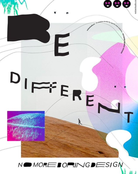
We like design styles that are attention-grabbing for the right reasons, concepts which are chaotic, but with a subdued yet striking aspect within the chaos. While many people do amazing work out there, we didn’t want us to be like them.
We are tired of seeing the same, minimalistic design, and felt the urge to create something that is somewhat different and slightly offbeat. We wanted to create something that stands out.
Our vision when founding Noise was to show that imperfect and crazy design is exciting and inspirational, to show that one should stop following the same minimalistic rules and do like everybody else, and to try to take design to a different level.
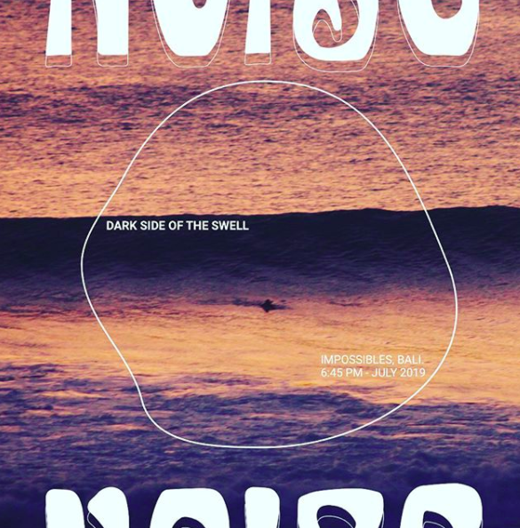
And that’s what we hope to also signalize with our typography - by integrating the viewpoint of graphic design with the surfing expression, the resulting aesthetic is full of fantasy and magic.
Can you explain to us why digital strategies are important for a business?
We could talk about this for hours!
However, to try to keep it short, we use the term “digital strategy” for the effort, research, and planning that goes behind the digital initiative(s). Basically, it’s all about getting to the bottom of what problem you are actually solving, the customer you are solving it for and the business goals you are trying to achieve.
Setting up a strategy and a digital roadmap is key to ensure that the technology and digital initiatives implemented support the business objectives and provides a better experience for the end-user.
The impact and opportunities of digital will vary by industry and by-product. The key is to look at the range of strategic possibilities that digital can bring to your business, such as target the global market; improve your company’s image; differentiate yourself from the competitors; increased company responsiveness and availability; better customer support; location freedom and so on, and decide upon your digital strategy from there.
As an example, Surfing With Amigas and MagicSeaWeed uses digital for competitive advantage, growth, and value creation.
MagicSeaWeed, as a digital service, has strengthened its advantage in speed and convenience by offering a consumer-facing mobile app (Android and iOS) that has streamlined the steps for checking and saving wave forecast. Surfers often check wave forecast on the go or in low wifi zones, and by offering mobile apps, MagicSeaWeed increases the value for the end-user and improves the entire user experience.
Surfing With Amigas offers surf camps in several locations around the world, with a sleek mobile responsive website and digital marketing strategy, Surfing With Amigas increases the company’s responsiveness and customer success, improves the company’s image and targets the global market. Potential customers can read about the camps and book at any time from any location.
As for digital products and applications, we have a quite simple and rational way of working. We don't believe crazy interactions and animations will make an app or a platform better. The digital product needs to be legible, and the user needs to understand what actions to perform and which flow to follow.
Excessive UI will kill the legibility; therefore, we prioritize meaningful UI over visually pretty UI. The digital product needs to work, be useful and provide value to the user, and the UI needs to emphasize that and make the entire experience excellent.
What are the most common brand-building mistakes surf companies make?
People tend to ask us to “create something beautiful”. However, we don’t think about brand and design as “beautiful” or “good”, we believe it should communicate, be functional and of value.
A brand is a lot more than just a logo and a colour palette. In essence, it’s your relationship with your customers, is how you communicate to the world who you are, how you differentiate yourself from the competition, and how you position yourself in the market.
To generate the desired image for your brand, it is important that the brand is consistent, speak the same language, and communicates the same message in every interaction with your target market.
Basically, the design uses visual means to convey your brand identity and brand strategy. Successful brand design has the power to communicate all sorts of feelings, emotions and brand attributes: it can make you hear the sound of the waves, feel the enthusiasm of the football match, and get a desire to go for a run.
We see a lot of early-stage startups and founders going directly to design, and forgetting about brand strategy and identity. But, to generate the desired brand image, the brand has to be holistic and embedded in an appropriate context.
If you’re creating a new product or a new brand, it is valuable to spend some time to understand your strategy, before you dive into your visual identity and start designing. By building a foundation and understanding who your brand is, what it stands for and who you’re trying to communicate with, you can make more effective design choices (this is a good exercise to get you started).
Noise Studio is developing an app; Go Surfing! Why a creative agency is interested in making an app?
We are making a product - CatchaSurf! Our goal is to get more people out in the waves, get rid of the everyday transport hassle, and help the environment at the same time.
In places such as Bali, Sydney or Sri Lanka, it’s easy to commute to the surf spots, as they are all pretty close and the locations are used to surfers.
But where we are from and surf (Argentina, Denmark, Norway), distances are large, areas are remote and the surf scene is smaller.
We want to create a vanpooling platform that connects surfers with cars with those who do not have mobility - facilitating not only the trip, but also start changing people’s mindset, make people aware how commuting together help us save the environment and take care of our planet.
Additionally, we hope to create local communities of surfers who share not only the waves, but the entire experience of commute, finding that perfect spot, and having a cup of coffee or iced coconut at the end of the session.
Follow Noise studio on Istagram: @noisestudioco
Interviewed by Irene Vannucci
Human rights enthusiastic, wipe-out lover, and chocolate addict, Irene is collaborating with Surfpreneurs Club as an intern to inspire you with the most exciting ventures in the surf community.


